Megamas is a training centre that focuses on the education of health, safety and environment for the oil & gas industry.
For this project: clear, professional, straightforward and modern is the goal for the company’s brand as a whole.

Logo
The only visual brand asset the company has at that time is the logo. As they were not looking to do a drastic rebrand, the early part of the project involves refining the existing logo so it looks more compact and clean.
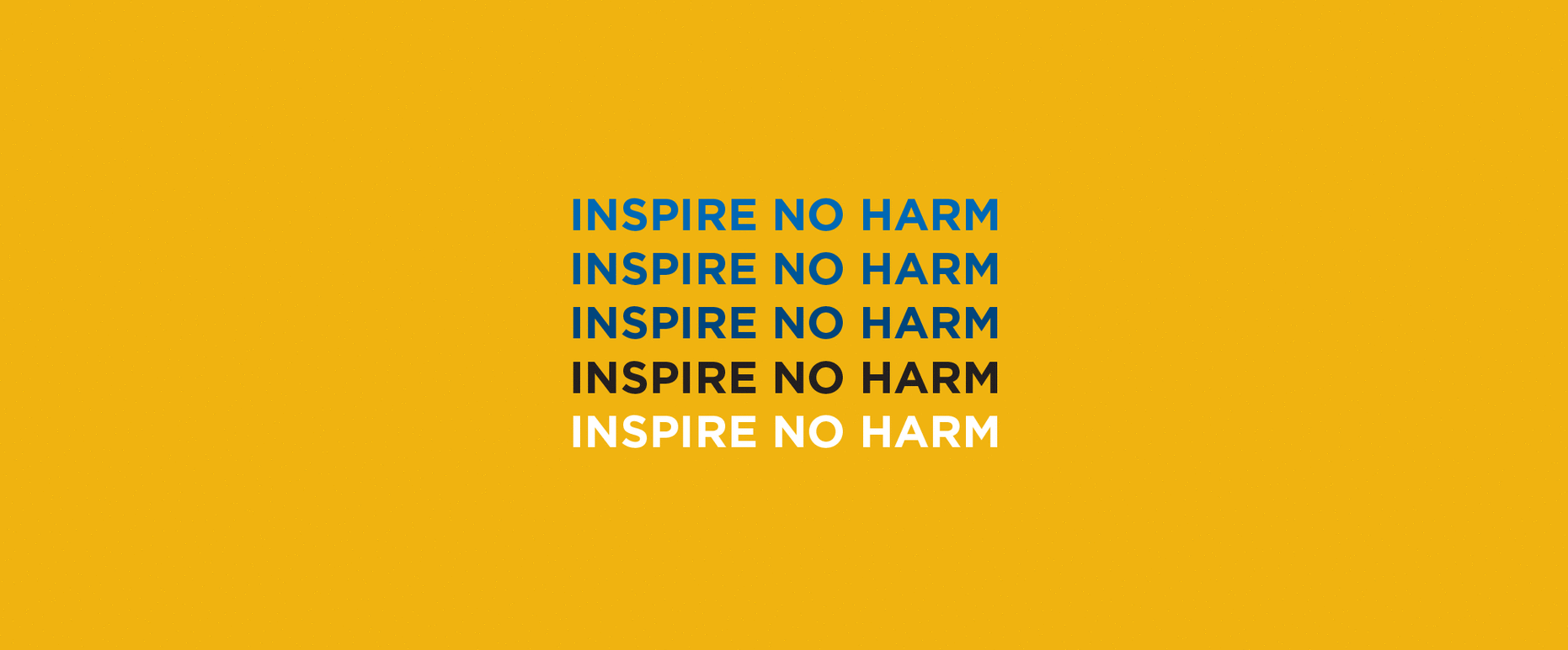
Tone of Voice: Slogan
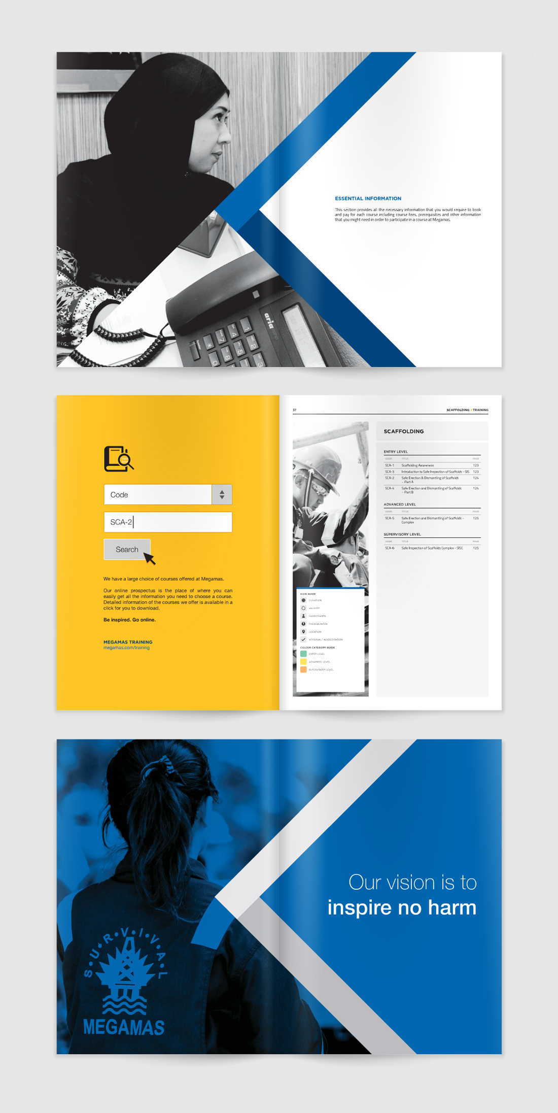
The next part of the project is to develop the brand. I worked closely with the company’s Business Development department and we created a slogan that reflects what the company specialises and believed in.
The company’s mission is to educate, and takes health and safety seriously.
It was simple: Inspire no harm.
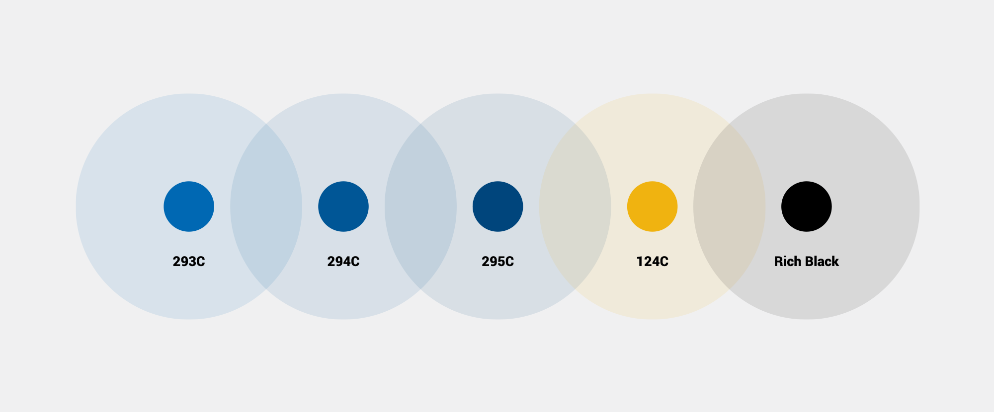
Brand Colours
Consistency is key, so we decided on the 3 company colours that should be used across the visual assets and marketing materials.
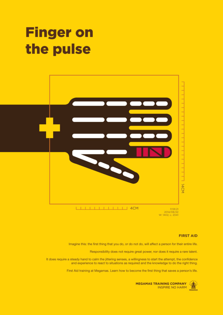
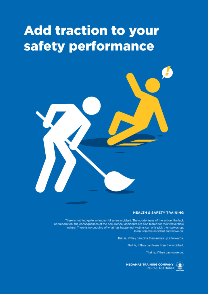
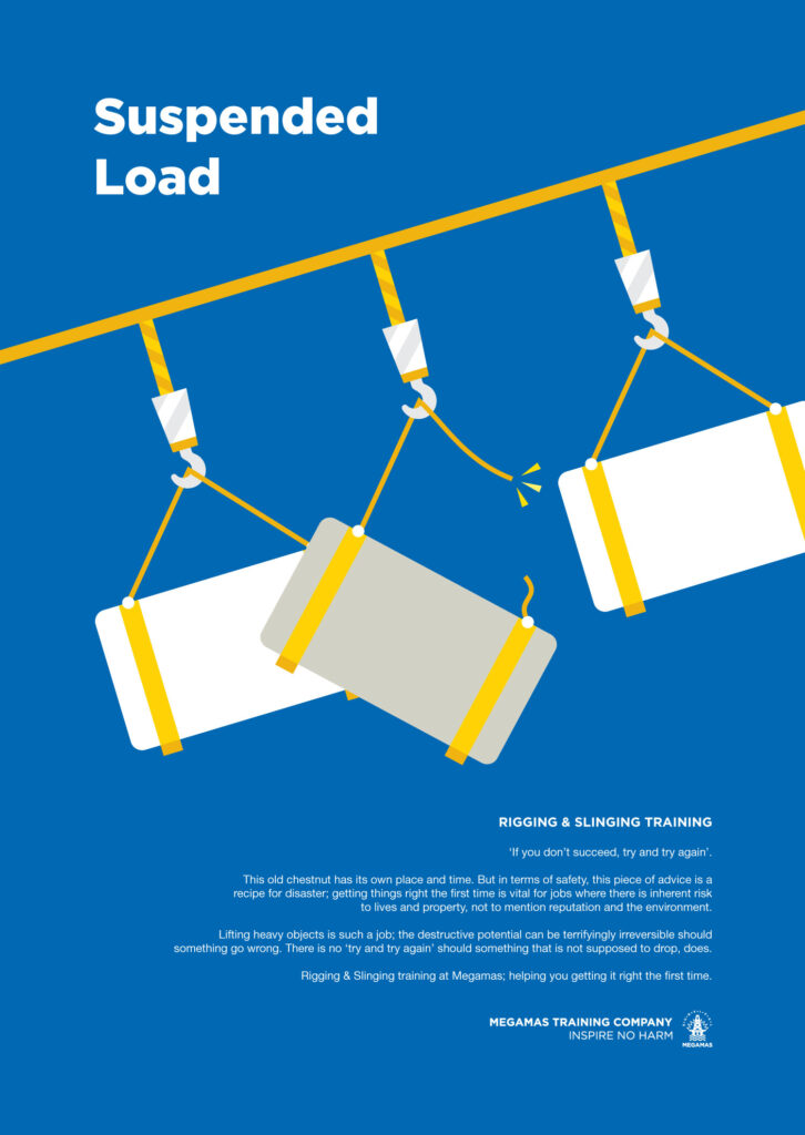
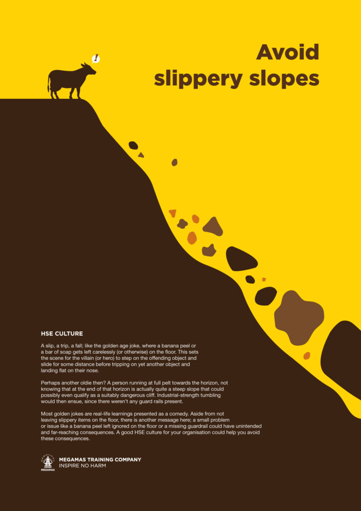
Posters
Illustrations inspired by safety signs.
Prospectus
One of the essential marketing material from the company is their prospectus— this is where the compilation of what the company is about and types of courses and services they offer are included. The company marketers often brought this with them when meeting clients or when the company is involved in an exhibition.
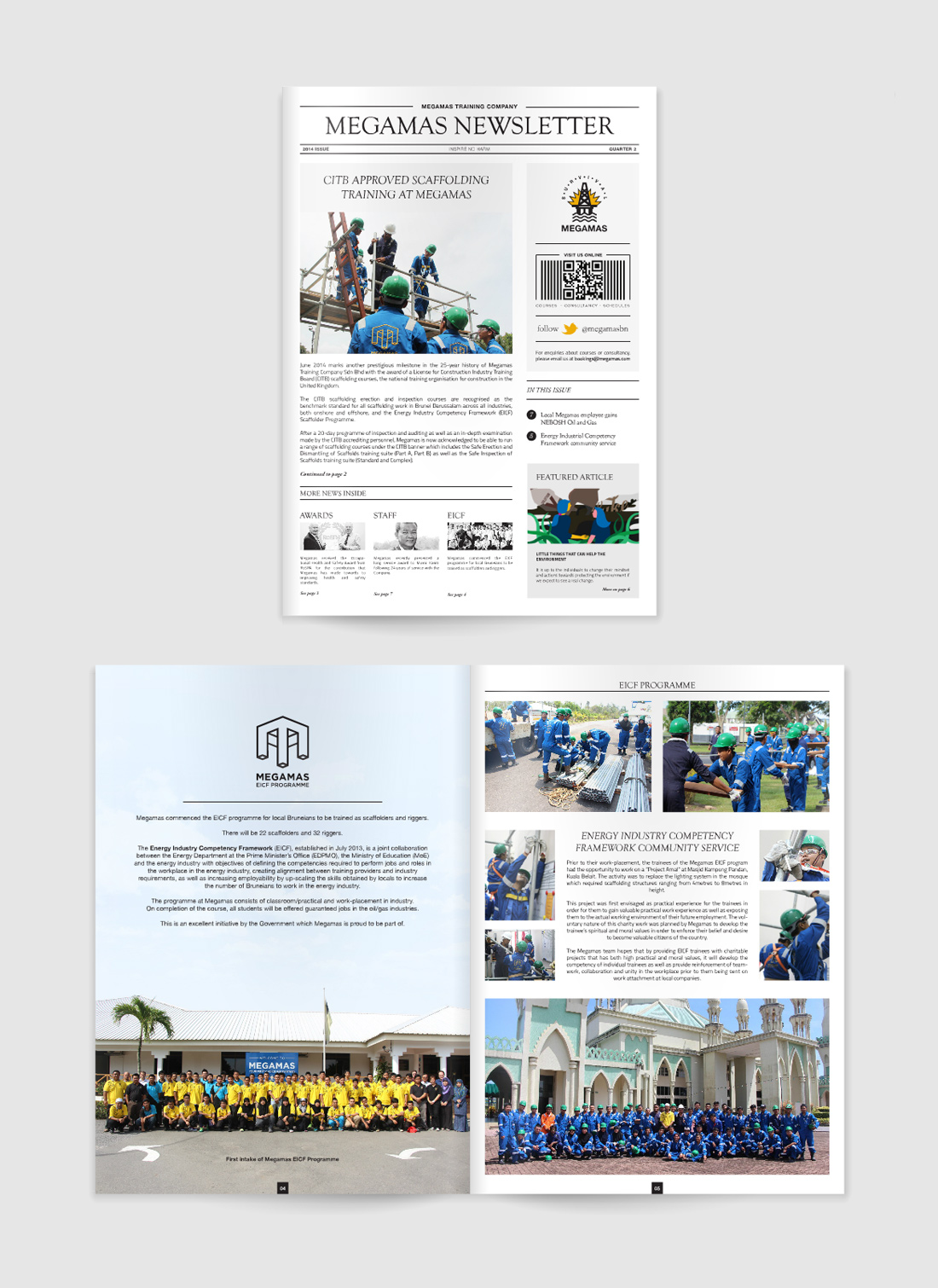
Newsletter
The company newsletter often publishes more than 30-pages, and the previous design overall felt generic and plain. Because it felt like a newspaper publication, I redesigned it to look like one.